The Next Design and Analytics Report Series : US Unemployment Map
I spent the weekend playing with R's mapping capabilties. For most purposes, I think you can accomplish more writing raw SVG wrapped in a flash interface to allow easy web interactivity like what we did for CAFf. However, there are some applications for which a good static cloropleth map can be very useful---like when you want quick situational awareness of important numbers that change at slow frequency.
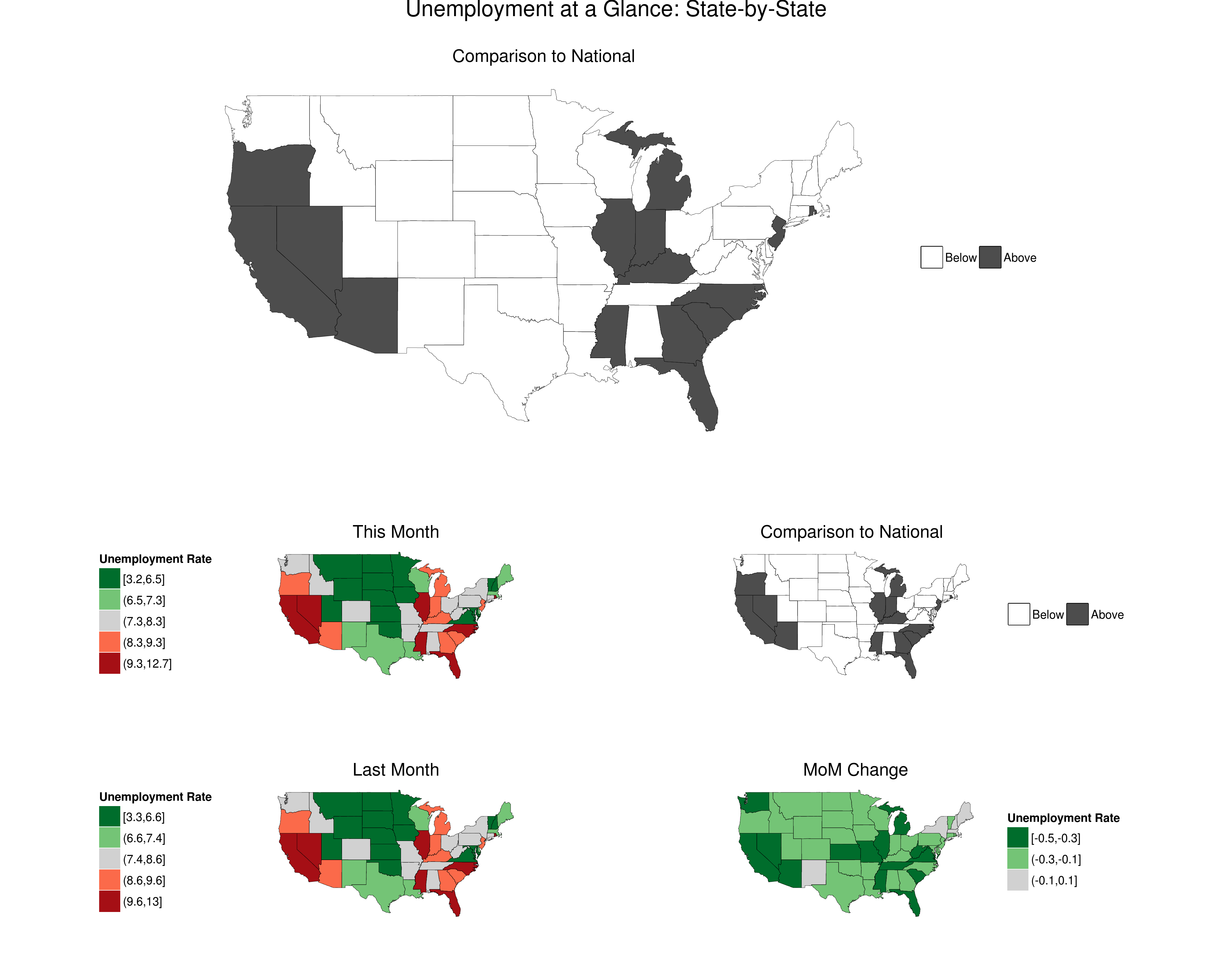
Following up on the first report series launched, the Arima Sector Forecast Reports, I'm going to add a regular GIS report to provide an at-a-glance view of US unemployment.
Here's a preview:
At launch, full features will also include:
- Automated summary preface providing context and orientation.
- Updates as data are released
- Large map at top will be at the MSA level, rather than the state level.
- Forecast component on what to expect next quarter
- Alaksa and Hawaii
- Aesthetic improvements
- A better economy (fingers crossed).
The report is one large page in PDF format, allowing for easy zooming to the county level, plus a preface page of orientation material.
Data comes from the BLS. Presentation code draws on great work and suggestions here, here and here.