Geography is Destiny (or totally made up)
...and maps are great. As I learn mapping software, I've shown the following map to three smart people, who didn't notice anything out of the ordinary, except the sharp cut-off of Antarctica:
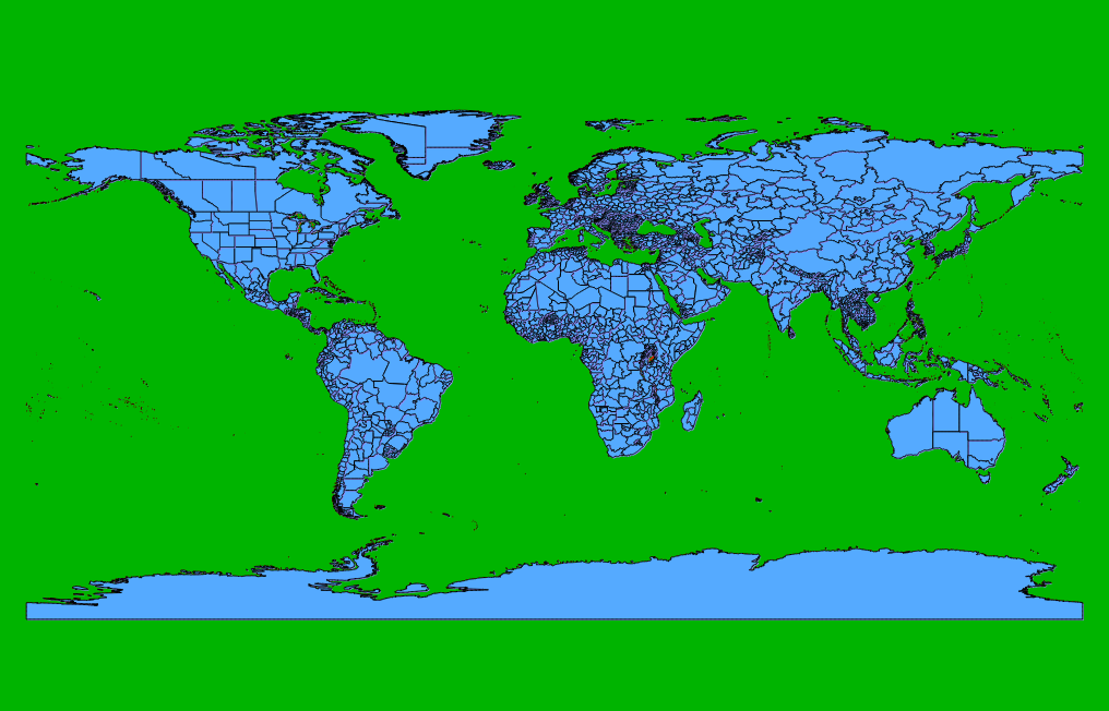
Did you catch it? I look at this, and it's deeply dissonant to my brain.
I title it the Buster-map, in which the water is green, and the land is blue. On the one hand, we've learned a lot of our map-reading conventions, and maybe this is just one more---so not so surprising. It's entirely arbitrary that North is "Up", for example...
There is no "Up" in space.
And there are debates over what projections are best for a particular purpose. Still, seen from a dock (or from space), water is very clearly blue and land is less so---so this convention is not entirely arbitrary:

Maybe more of the map should be white or swirly...
My suspicion is that through electoral maps, seeing red and blue states of an America suspended in space, has desensitized us a little to this somewhat-trained, somewhat-natural map-reading convention. I like it anyway.
If you can't or don't want to use google maps, but want interactivity, it seems the state of the art in interactive maps are down to Kartograph.js and D3 (with honorable mentions to libraries raphael and processing). I've been learning D3 for awhile, but am quite impressed with Kartograph. See Gregor Aisch's interactive Kartograph map of Italy, which is just plain beautiful design, even when not animated.
D3 is also an impressive library---and due to its being a more comprehensive interactive data library---time series, networks, and bar-charts, too---would be my recommendation to the aspiring web cartographer (it's the one I've picked to learn). Mike Bostock has some great visualizations of things like every map projection you've never heard of, a convenient globe, and some maps just for fun, too.
Naturally, I'll be posting updates in a series as I learn how to do more.